Building on a previous co-design session, Ming Liu (writing analytics research fellow) and Simon Buckingham Shum (project lead) recently ran a follow-up session with Cherie Lucas (Discipline of Pharmacy, Graduate School of Health). The task was to design the first version of the Feedback Tab in AcaWriter, for reflective writing.
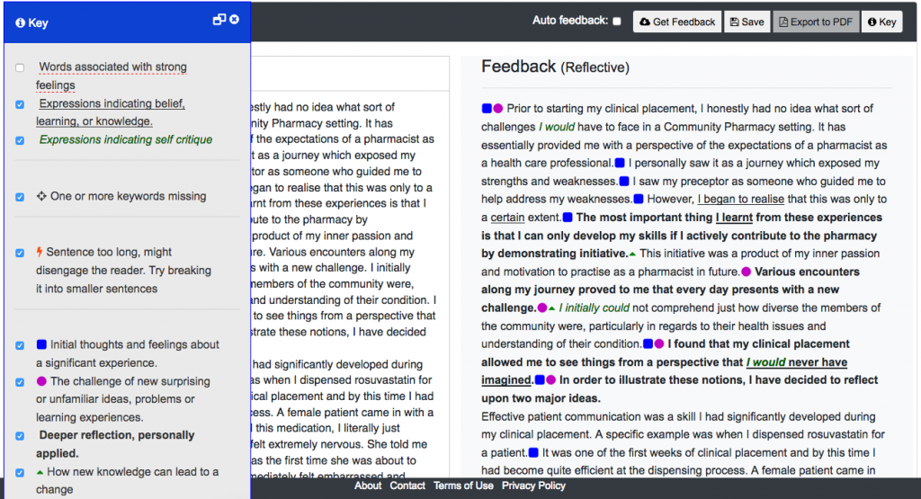
The AcaWriter screen looked like this:

Zooming in, the feedback looked like this (click to enlarge), with sentences annotated using icons and font:
(Learn more about the underlying model of textual features, and a study to evaluate initial student reactions to it.)
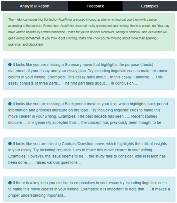
PhD work by Shibani Antonette has added a new Feedback Tab for other genres of student writing in Law (essays) and Accounting (business analyses), while Sophie Abel has designed feedback for PhD students’ on their research abstracts. As you can see from those examples, in addition to the Analytical Report Tab which annotates sentences in the student’s text, the Feedback Tab gives explicit summaries about the meaning of the highlighting, and suggesting what the student might do to improve their draft. Here’s an example from Law:

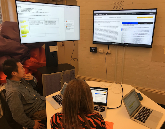
So, this is what we needed to do for reflective writing. The task was to define a set of rules, which will trigger feedback advice to students given the presence or absence of particular features. The 2 hour design session was set up as shown below, with a Google Doc template on the left screen, and AcaWriter on the right:

For a given feature (col.1), we considered what should be said to the student if it appeared (col.2) or was missing (col.3). You can also see that more complex patterns emerged:
Presence of one feature but absence of another:
(triangle without square) While it appears that you’ve reported on how you would change/prepare for the future, you don’t seem to have described your thoughts, feelings and/or reactions to an incident, or learning task.
(triangle without preceding circle) While it appears that you’ve reported on how you would change/prepare for the future, you don’t seem to have reported first on what you found challenging. Perhaps you’ve reflected only on the positive aspects in your report?
Repeated feature in successive sentences:
(double circles) Well done, it appears that you may have expanded the detail on the challenge you faced.
(double triangles) Well done, it appears that you have expanded the detail on how you would change/prepare for the future.
Location-specific features:
(triangle in para1) It appears that you have reflected on this very early on. Please ensure that you recap this in your conclusion about the outcomes of your reflection.
Note the qualified tone of the feedback: it appears that you have… you don’t seem to have… Writing is so complex that the machine will undoubtedly get things wrong (something we’ve quantified – as one measure of quality). However, as we’ve argued elsewhere, it may be that imperfect analytics have specific uses for scaffolding higher order competencies in students.
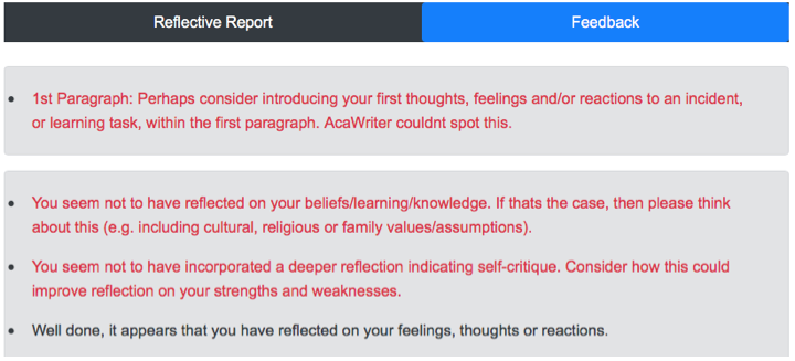
After 2 hours, we had a completed template, which we could hand over to our developer to be implemented. The Feedback Tab is no longer empty…
Header on all feedback:

Encouraging feedback when features are present:

Cautionary feedback when features are absent:

To summarise, co-design means giving voice and influence to the relevant stakeholders in the design process. Too often, it feels to academics and teachers as though they’re doing all the adjusting to educational technology products, rather than being able to shape them. Since we have complete control over our writing analytics infrastructure (and so can you, since we’ve released it open source), academics can shape the functionality and user experience of the tool in profound ways.
Ultimately, we need to build infrastructure that educators and students trust, and there are many ways to tackle this, co-design being just one.
How do students respond to this automated feedback? Trials are now being planned… We’ll let you know!…
